Senpai
EdTech – Landing Page
My Role
Product Designer
Content Designer
UX Writer
Background
Senpai is an AI-powered mobile app, designed to help students study more effectively and confidently pass their certification exams—beginning with Registered Massage Therapy in Canada, where many learners are international, navigating dense clinical content in a second language.
Senpai's goal is to eliminate overwhelm through user-friendly study notes, practice tests, and multilingual support, while building a scalable platform that can expand into other professions with similar learning barriers.
Objective
Design a landing page to drive awareness, communicate Senpai's benefits, and motivate RMT students to beta test the app.
______________
Senpai
EdTech – Landing Page
Background
Senpai is an AI-powered mobile app, designed to help students study more effectively and confidently pass their certification exams—beginning with Registered Massage Therapy in Canada, where many learners are international, navigating dense clinical content in a second language.
Senpai's goal is to eliminate overwhelm through user-friendly study notes, practice tests, and multilingual support, while building a scalable platform that can expand into other professions with similar learning barriers.
Objective
Design a landing page to drive awareness, communicate Senpai's benefits, and motivate RMT students to beta test the app.
My Role
Product Designer
Content Designer
UX Writer
______________
Landing Page
Challenges
- Language accessibility: The messaging needed to impress fluent English speakers, while remaining clear and approachable for ESL users.
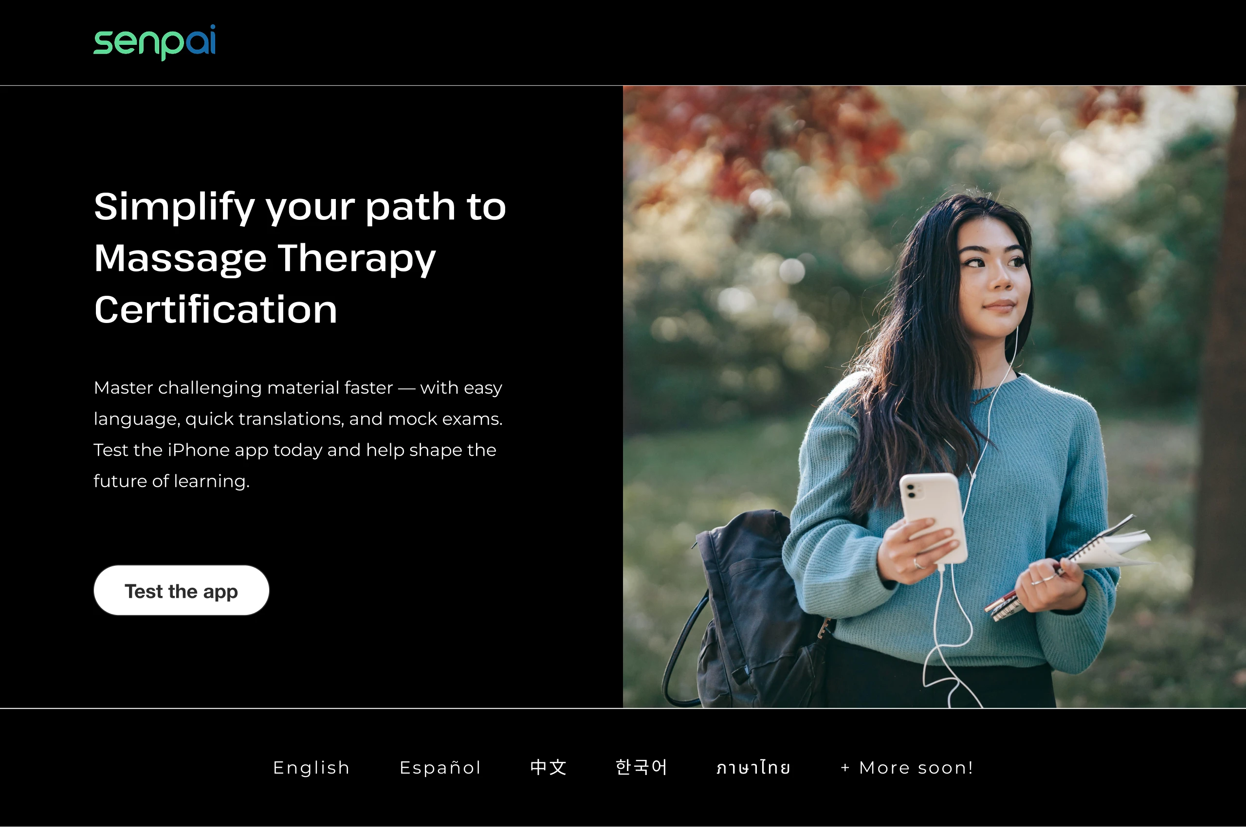
- No product visuals: With the app still in beta and UI screens evolving, we had to communicate value without showing the interface.
- Balancing trust and urgency: Trust was essential for an unfamiliar product still under development. Meanwhile, we needed to convert testers quickly so the client could validate and go to market as soon as possible.
Solutions
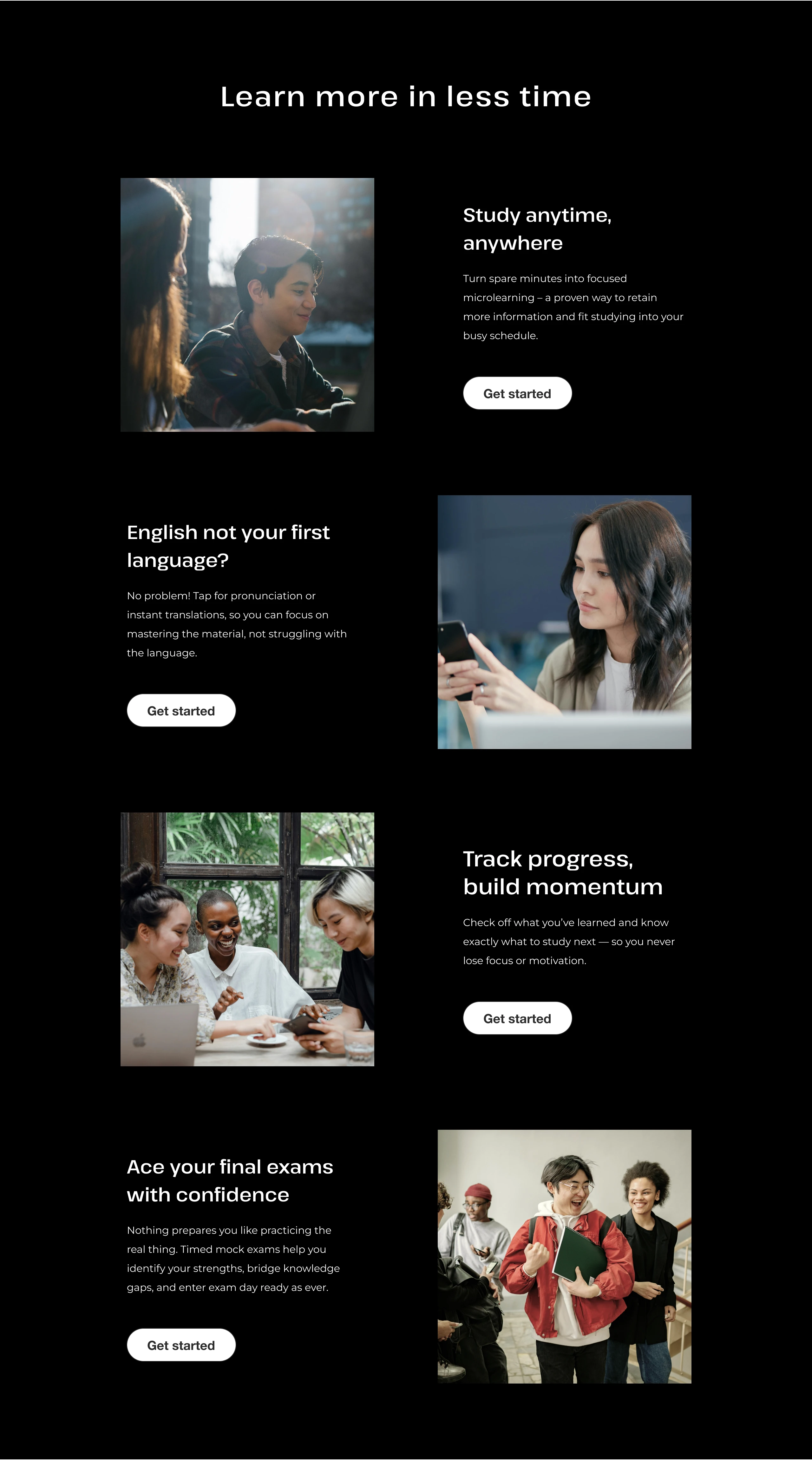
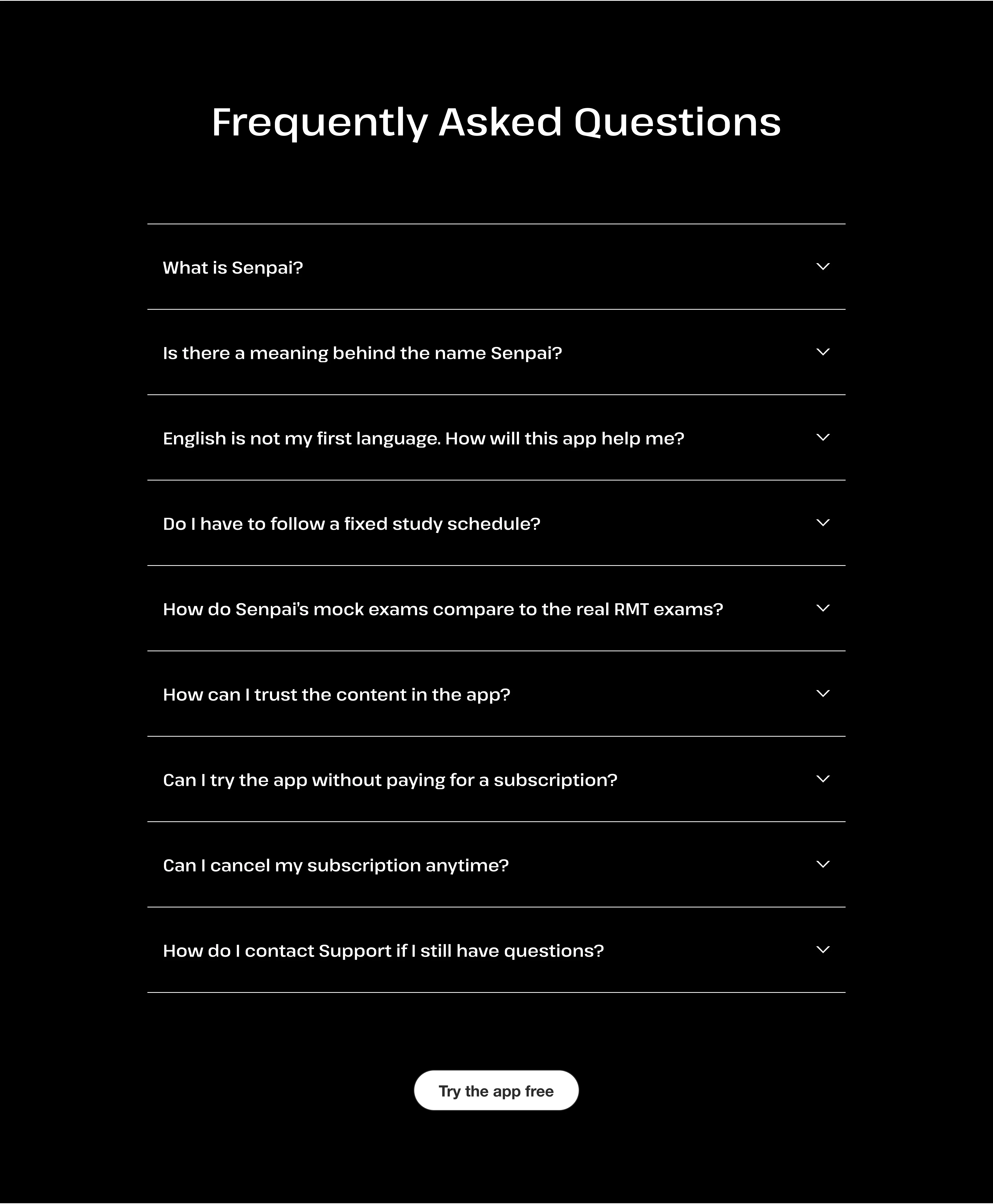
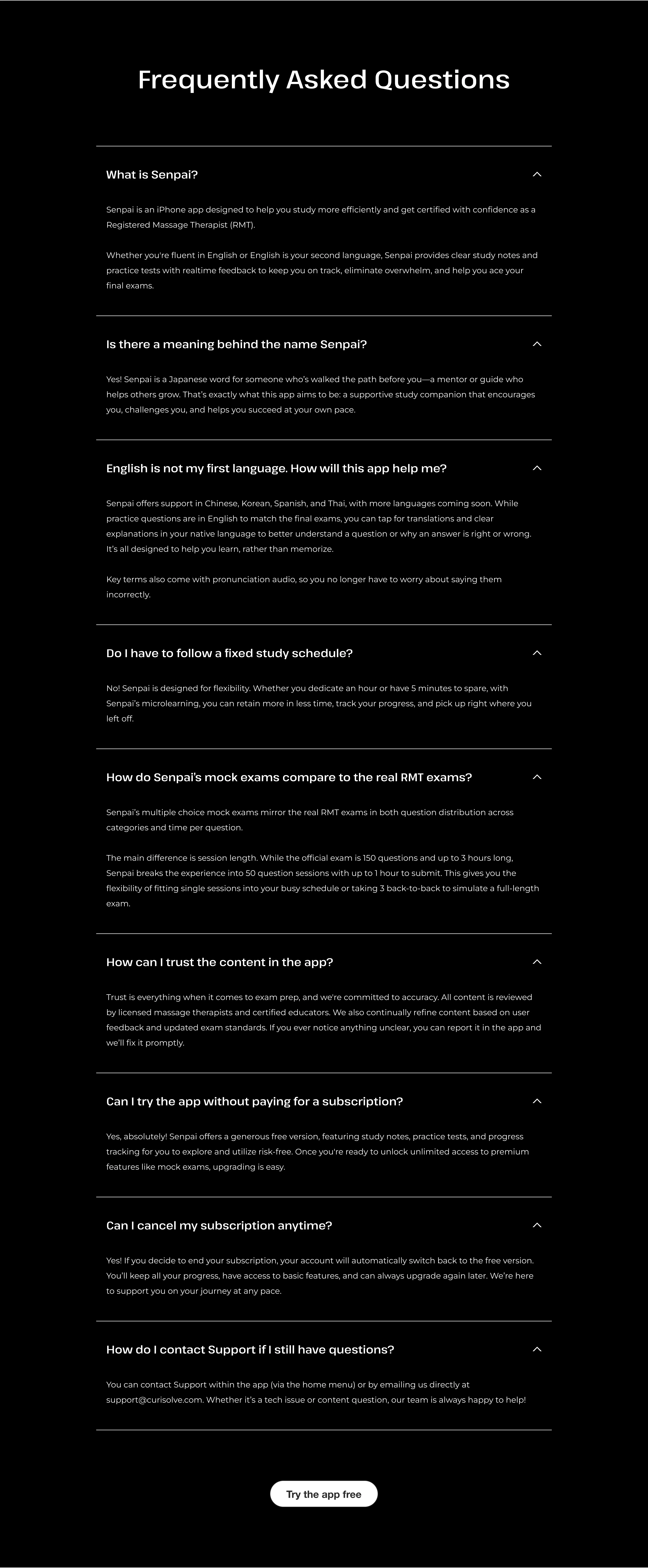
- Scannable content: I prioritized clear, concise, and impactful headings to communicate value at a glance for all reading levels. I used modular sections, short paragraphs, clear hierarchy, and generous spacing to make the page easy to digest. An accordion style FAQ helped further reduce clutter, providing additional clarification only when relevant to the user.
- Benefits-first strategy: Rather than lead with app features, I framed the content around student pain points and desired outcomes to build emotional resonance.
- Human-focused visuals: In place of UI screens, I curated stock photography to create a sense of community and empower users independently. I sourced strictly free images to help my client test leanly—thoroughly filtering for photos that aligned with the copy and felt cohesive, despite being from different photographers. The visuals not only made the page more dynamic, it gave it a polished, trustworthy feel.
- Timing and transparency: I avoided front-loading any overexplanation of the beta to prevent early drop-off—focusing first on building interest and rapport. More context was revealed gradually down the page and through CTAs. A “Coming Soon” section also managed expectations around features in development.
- Identity-driven messaging: I appealed to the user’s sense of purpose and influence, inviting them to help shape the future of learning. Emphasizing that the offer was limited, meaningful, and free would also inspire those who viewed themselves as savvy or early adopters to try the product risk-free. The tone was empowering and collaborative, not salesy, and designed to build trust while motivating action.
Landing Page
Challenges
- Language accessibility: The messaging needed to engage fluent English speakers, while remaining clear and approachable for ESL users.
- No product visuals: With the app still in beta and UI screens evolving, we had to communicate value without showing the interface.
- Balancing trust and urgency: Trust was essential for an unfamiliar product still under development. Meanwhile, we needed to convert testers quickly so the client could validate and go to market as soon as possible.
Solutions
- Scannable content: I prioritized clear, concise, and impactful headings to communicate value at a glance for all reading levels. I used modular sections, short paragraphs, clear hierarchy, and generous spacing to make the page easy to digest. An accordion style FAQ helped further reduce clutter, providing additional clarification only when relevant to the user.
- Benefits-first strategy: Rather than lead with app features, I framed the content around student pain points and desired outcomes to build emotional resonance.
- Human-focused visuals: In place of UI screens, I curated stock photography to create a sense of community while also empowering users independently. I sourced strictly free images to help my client test leanly—thoroughly filtering for photos that aligned with the copy and felt cohesive, despite being from different photographers. The visuals not only made the page more dynamic, it gave it a polished, trustworthy feel.
- Timing and transparency: I avoided front-loading any overexplanation of the beta to prevent early drop-off—focusing first on building interest and rapport. More context was revealed gradually down the page and through CTAs. A “Coming Soon” section also managed expectations around features in development.
- Identity-driven messaging: I appealed to the user’s sense of purpose and influence, inviting them to help shape the future of learning. Emphasizing that the offer was limited, meaningful, and free would also inspire those who viewed themselves as savvy or early adopters to try the product risk-free. The tone was empowering and collaborative, not salesy, and designed to build trust while motivating action.


FAQ
Accordion Expanded
FAQ
Accordion Expanded
